Fusedash
Fusedash instantly turns raw data into clear dashboards and charts for your team.
About Fusedash
Fusedash is an AI-powered data visualization platform designed for teams that need clarity and action from their data, not just more charts. It acts as a unified mobile-first workspace where you can create decision-ready dashboards, interactive charts, detailed maps, and narrative reports without rebuilding the same logic across disconnected tools. The core value is consistency and efficiency: you define your key metrics and KPIs once, and then reuse those trusted definitions across every view and report. This ensures everyone—from leadership to marketing to operations—is aligned on the same numbers. Built for teams tired of manual reporting cycles and conflicting data stories, Fusedash empowers users to not only monitor what's happening through real-time interfaces but also understand why by drilling down into segments or time periods. With integrated AI features like natural language data chat and smart visualization assistance, it makes data exploration faster and more accessible. Simply connect your data via CSV or API, and Fusedash transforms it into a shared source of truth that drives alignment and informed action, all from an intuitive, app-centric interface.
Features
Flexible Views
Build the right dashboard view for every audience within the same platform. Fusedash lets you transform a single dataset into interactive dashboards, standalone charts, detailed maps, or narrative report-style views. Customize layouts, filters, and time ranges for different stakeholders, ensuring each team sees what matters most without any extra back-and-forth or manual duplication of work.
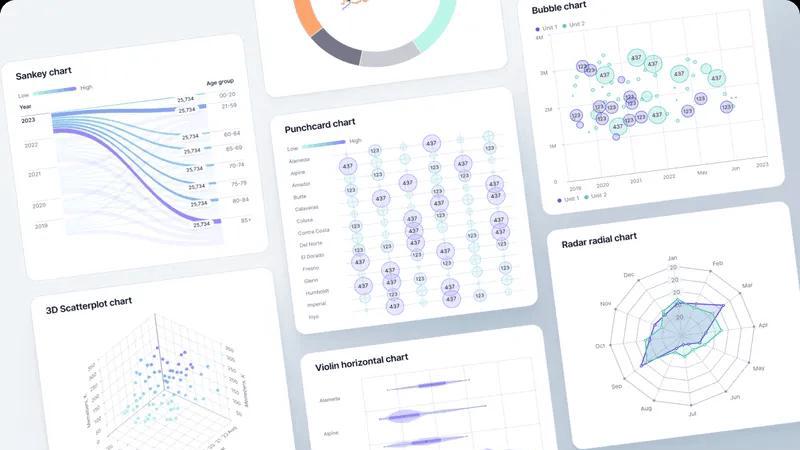
AI Chart Generator
Instantly create clear, AI-powered charts from your CSVs or connected APIs. This feature acts as a fast visualizer, intelligently suggesting the right chart type, applying comparisons, and helping refine labels so your visuals tell the correct story at a glance. Generated charts can be used as standalone assets or seamlessly dropped into broader dashboards and reports for cohesive storytelling.
Unified Dashboard & Reporting Workspace
Go beyond static dashboards by combining real-time KPI monitoring with narrative context. This workspace allows you to embed storytelling sections directly alongside performance charts, making it clear what changed, why it matters, and what the next steps are. This integration reduces conflicting report versions and keeps all teams aligned on insights and actions.
AI-Powered Smart Chat
Accelerate data exploration and dashboard refinement using plain language. Ask questions about your data, request breakdowns by segment or region, and get intelligent suggestions for relevant metrics or chart types. You can then instantly turn these conversational insights into polished, shareable views that your team can use immediately within the platform.
Use Cases
Executive & Leadership Reporting
Provide leadership with a single, trusted source of truth. Consolidate data from multiple departments into a unified executive dashboard enriched with narrative storytelling. This gives leaders a clear, high-level view of performance against KPIs with the necessary context to understand drivers and make strategic decisions confidently.
Marketing Campaign Analysis
Enable marketing teams to move from data to insight rapidly. Connect campaign data from various APIs, visualize performance trends with AI-generated charts, and drill down into segments to see what's working. Share live dashboards with stakeholders to demonstrate ROI and adjust strategies in real-time without manual report rebuilding.
Operational Performance Monitoring
Give operations teams a real-time interface to monitor key processes and metrics. Create dashboards with maps to visualize geographic performance, set up automatic data refreshes, and use drill-downs to identify bottlenecks or regional issues instantly, ensuring swift, data-driven operational responses.
Cross-Departmental Data Alignment
Eliminate silos and conflicting data stories across an organization. By defining core metrics once in Fusedash and reusing them in dashboards for sales, finance, and customer support, every department operates from the same consistent numbers. This fosters alignment, reduces reconciliation time, and ensures collaborative action based on a shared reality.
Frequently Asked Questions
What types of data sources can I connect to Fusedash?
Fusedash is built for flexibility. You can start instantly by uploading CSV or Excel files. For live data, you can connect directly to various business APIs and databases. The platform also allows you to combine multiple datasets, including enriching your views with relevant public data, all within a single workspace.
How does the AI Chart Generator work?
The AI Chart Generator simplifies visualization. After you connect your dataset, the AI analyzes your data structure and suggests the most appropriate chart types to effectively communicate trends and comparisons. You maintain full control to refine labels, apply filters, and adjust the design, turning raw data into a clear visual story in minutes.
Can I create different views for different teams from the same data?
Absolutely. This is a core strength of Fusedash. You can build a master dataset with consistent metric definitions and then create multiple, tailored views from it. For example, a detailed, interactive dashboard for analysts, a high-level summary chart for executives, and a geographic map for field operations—all pulling from the same trusted source.
What is Smart Chat and how can it help my team?
Smart Chat is an integrated AI assistant within Fusedash. Instead of navigating complex menus, you can ask questions about your data in plain language, like "What were sales in Q3 by region?" or "Show me a breakdown of website traffic by source." The AI interprets your query, generates the answer visually, and helps you instantly convert that insight into a saved chart or dashboard view.
Similar to Fusedash
GeoRank
Planning a relocation or long-term stay abroad? Compare places on sunshine, cost, tax, visa and stay duration, then ask AI about your shortlist.
EnsembleData
EnsembleData provides real-time social media data APIs to effortlessly scrape and analyze posts, profiles, and engagement metrics at scale.
Decker
Decker empowers consultants to efficiently create, manage, and monetize deliverables with expert support and AI-driven workflows.
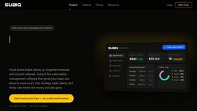
Subiq
Subiq gives small teams one place to track, manage, and cut unused SaaS subscriptions to stop wasted spend.

Toon Tone
Toon Tone is a free daily game where you guess cartoon character colors using HSB sliders to test your memory and perception skills.
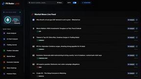
FX Radar
FX Radar delivers real-time forex news and an AI-powered trading journal to track your performance.
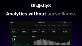
GhostlyX Privacy-First Web Analytics
GhostlyX provides privacy-first web analytics that deliver actionable insights without cookies, ensuring user data is always protected.